 Every year after the holidays, I am excited to put the Christmas away and to create something new for the new year. This year I am in a British mood as I have been reading British editions of Country Home, Country Homes & Interiors, and English Home magazines. I was inspired by a photo in one of these magazines, where a hutch was filled with French linens, white dishes and some touches of silver. So pretty!
Friday, January 28, 2011
New Year In Blue
Every year after the holidays, I am excited to put the Christmas away and to create something new for the new year. This year I am in a British mood as I have been reading British editions of Country Home, Country Homes & Interiors, and English Home magazines. I was inspired by a photo in one of these magazines, where a hutch was filled with French linens, white dishes and some touches of silver. So pretty!Fall In Blue

For Fall, I brough out my earthy toned things. Some of my Brown Wear, My mother-in-law's Brown Betty teapot, and some of my fall dishes etc... I was really pleased with this look, as I wasn't too sure what this color scheme would look like against this bright blue. It actually made them pop, which I love.
Completed
 Well, this is it! I am very happy with the way it turned out. I am especially loving how pretty things look inside of it. I change it seasonally, and everything I have put in it looks wonderful :)
For this spring and summer look, I filled it with some of my green and pink depression glass. I added a few other things for color. I found the green glass knobs at Anthropology.

I know this picture is sideways... but, I'm just learning!
Anyway, this picture in one of my magazines became my inspiration for wanting a distressed blue piece. I loved the handles on this dresser so much, but have not found any this pretty yet. I will keep my eye out though. You never know when you might find what you are looking for. :)
Thursday, January 27, 2011

Cabinet Redo
 This is our diningroom before we painted it yellow. I chose this picture though because it is the only "before" picture I could find of the cabinet in the corner. This piece has a fun history because it was the first thing Jeff and I bought on credit when we were young in our marriage. (in order to establish credit) . It has a matching table and chairs as well, but when we moved, they found a home at our son's house. Anyway, I wasn't loving this two-toned look anymore, but I didn't want to get rid of it either. So, I started thinking about painting it.
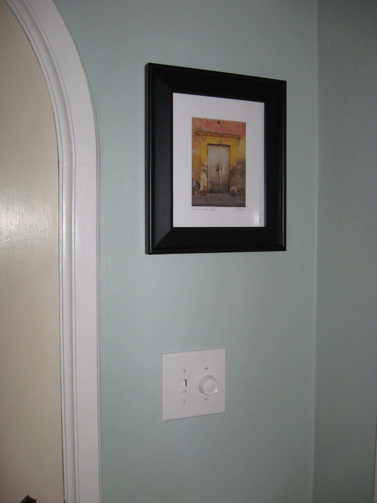
It took a little longer than it should have to get this project done... putting the new switchplates on was a breeze, but several of our on/off switches were actually a dark old brown color... so, I got out my tiny paintbrush and painted them :) I used the satin white paint we had used for our trim, which dried quickly and had the perfect shine needed to make it look like white plastic. I think Jeff might be happy tonight when he sees my work. He thought he was going to have to buy all new electrical boxes for these! So fun.

Our little house has these old brass switchplates everywhere. They aren't real ugly, but kind of dated and they show up a lot against our new paint colors. We went to the hardware store to look for new ones and actually liked the plain white ones best. This was cool, because they were one of the least expensive. :)
Monday, January 24, 2011
Yes, I DID use Martha's Rain Water again! We really love this color and I didn't want to introduce another color into the mix. I am planning a photo wall near the top and think the photos in black frames will look great against this color. We also have all the hardware for a carpet runner, which I will add as soon as we have the extra money. I think I'll go for a sea grass or another natural fiber. We'll see...


This is one end of the living room before we painted. This would have been Christmas last year (our first Christmas in Seattle) I had hung some drapes from IKEA just to bring in some color. I can't believe you can buy drapes like these for $14.00 a window. These were a real life saver for those first 6 months or so while I looked for paint colors. Although we have downsized quite a bit, most of our furniture fits nicely in this house. We are especially happy with our "larger" livingroom, as compared to the small livingrooms found in most older homes here.


I chose Martha Stewart's Rain Water for the entry. We really love this color. This photo makes it look a little lighter then it actually is, but it is very fresh and pretty. I have never painted anything blue before, so this was my first "brave" move. The walls in the living and dining room are Glidden's Corn Silk. It took many test colors to find this yellow. The thing I like about it is that it changes with the weather outside. It keeps things feeling bright and sunny, but it is also a "warm" yellow that feels calm and cozy on a rainy day. All the trim throughout the house will be done in Martha's Tailor's Chalk.
New House Love
 I have to start somewhere, so I thought I would show some before and after pictures of what we have done so far. This is our front door/entry in it's original color. Not a bad color, but very dirty in real life and not very cheery for the rainy dark weather we get here. we are thrilled with the original lighting left in this home. The sconce on the left and the fixture peeking out above the door are two of nine :)
Subscribe to:
Posts (Atom)